
Motorcycle Pages
Driving purchase intent and increasing conversion.
Role
UX Designer
Project
Team
2 UX, 1 UI, 1 Project Manager
Timeline
7 weeks, August - October 2024
With an expanding product line and audience, motorcycle pages needed an uplift to drive purchase intent.
Overview
I shaped the UX of these Product Detail Pages by leading the UX research, defining the narrative, structure and flow, and designing wireframes and components.
Here’s an example of a motorcycle page that went live with our new design.
Get riders one step closer to purchase
Generate more leads for dealerships so they get more customers through the door.
Business goals
Enhance website performance
Support the interest and consideration phases of the purchasing flow which are done online.
For riders, inspiration starts online.
Key insights
I surveyed Triumph customers, motorcycle enthusiasts, and talked to sales at the dealership to understand how riders purchase a bike.
-
Riders want hard numbers (power, torque, seat height, weight) and assurance of reliability, but the emotional trigger comes from styling, finish, and imagining the experience on the road.
-
Riders don’t just look at the motorcycle in isolation - they’re actively comparing models, considering accessory packs, and looking for ways to make the bike their own.
-
People research online (reviews, configurators, comparisons), but the final decision is made in dealerships where personalised advice, expert opinion, and real-world validation complete the purchase.
-
Auditing Triumph’s motorcycle pages and looking at competitor sites like Honda, BMW, Moto Guzzi, and Harley, it became apparent that they all took a similar, transactional approach to their PDPs. Pages looked similar across all brands and lacked a narrative, emotional appeal.
If we make riders fall in love with the bike, we get them one step closer to purchase.
The website is used as an initial entry point to browse bikes and understand the experience of the ride. If we make riders fall in love with the bike and create an emotional pull, we can push them further down the purchase funnel and differentiate ourselves from the competition.
Create pages that elicit desire.
Idea
Inspire
Design and features
Show the bike in action and inspire a lifestyle
Knowing that the look and feel of the bike creates an emotional tie from the research, we use video in the hero for an initial pull. Riders see what the bike looks like on the road and can visualize real-world performance.
We position key CTAs above the fold for riders who are ready to get in touch with the dealership.
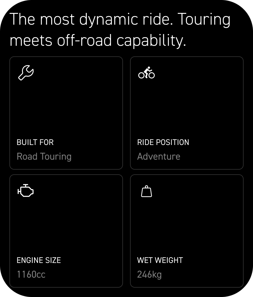
Snapshot
Give riders a quick snapshot of the bike:
Type of ride the bike is built for
Ride position
Tech specs we know influence purchase decisions: engine size and wet weight
Giving users this type of overview gives them the key beats before diving into detail, making the page scannable and using specs we know impact decision making, based on the research.
360 view
Designed a 360 degree view of the bike to highlight key features without breaking immersion — using parallax scroll and close-up visuals to showcase the bike’s craftsmanship.
This gives users an overview of specific features of the bike with a visual aid to keep them emotionally invested and immersed in the content.
Trust
Getting into the details
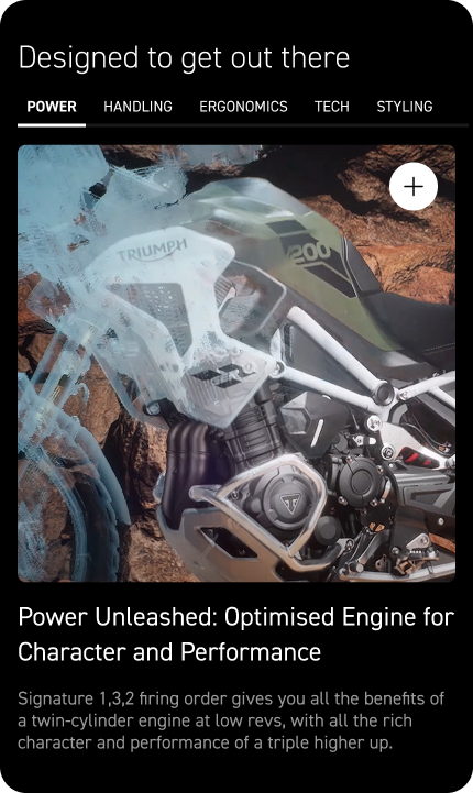
Created a consistent template for the engineering and handling details. Used benefit-led, simple language so riders understood the impact on their ride:
Power: Engine design and performance features.
Handling: Features related to responsiveness to the rider's inputs and ease of control.
Ergonomics: Elements focused on rider comfort and positioning.
Tech: Features involving connectivity, software, dashboard display, navigation, cruise control, and hill hold control.
Styling: Aesthetic elements such as chrome finishes, paintwork, and seat materials.
Tech specs
Highlight the most popular specs that drive purchase decisions by keeping them high in the visual and information hierarchy of the component.
We used cards and images to make them easy to scan.
Initial design

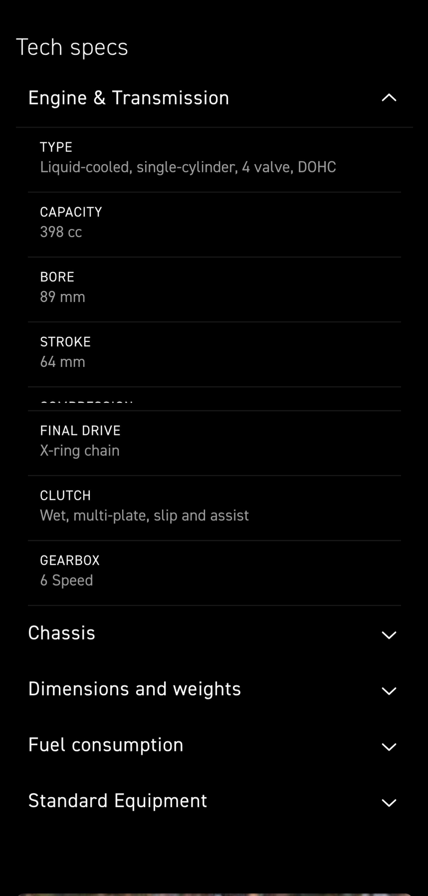
Due to development budget constraints and asset availability, a simple accordion was implemented instead.
The accordion still provides visitors with key tech specs and uses progressive disclosure to prevent overwhelm.
Final implementation
Personalize
Accessories
Accessories previously linked out to a separate page with text and images. We pulled accessories onto the page with a gallery component that opened a modal for detail, making the information more visual, useful, and engaging . This kept riders on the motorcycle page and in exploration mode, instead of diverting them away.
Compare
Discover similar models
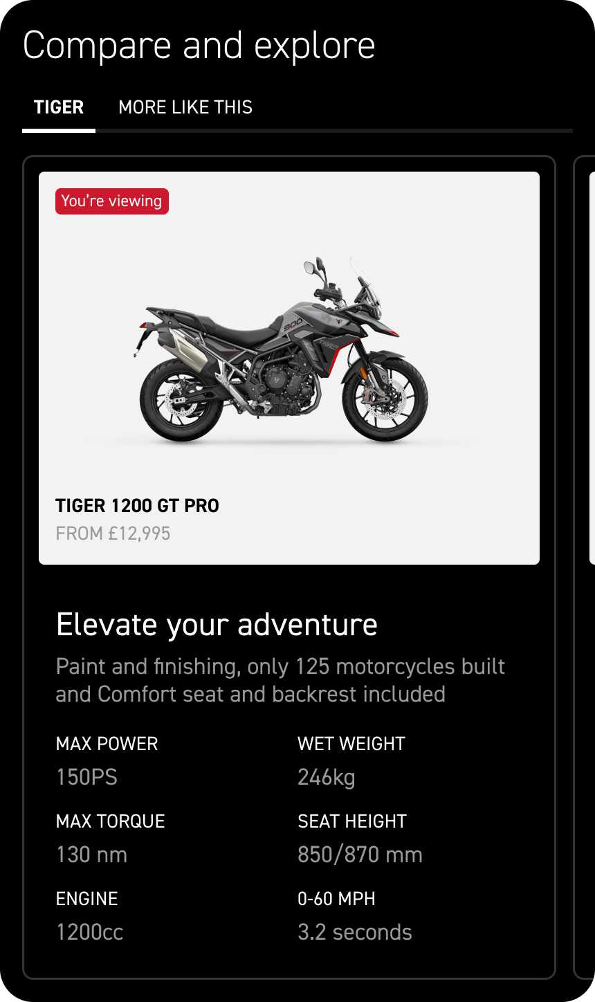
Because riders tend to compare bikes within the same genre or engine class, we created a comparison module tailored to their decision-making behavior.
Each bike card highlights the essentials—specs, USP, and color options—so users can instantly rule bikes in or out and focus on the models that match their riding style.
Convert
Key calls to action
After riders move from inspiration to detailed specs, we surface CTAs that match their readiness—whether they’re booking a test ride, exploring financing, want to talk to a dealer, or see which offers are available.
All actions lead the rider to a dealership where the real purchase and conversion happens, and ensure there’s an onward journey.
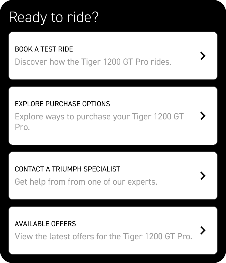
Riders successfully get one step closer to purchase
Results
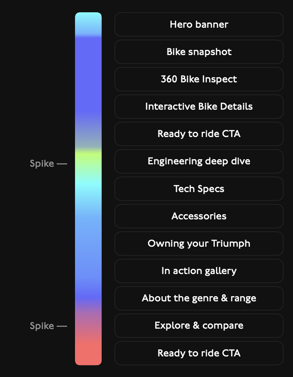
The journey of the page and structure is working as it should – guiding riders from inspiration to action. We go from scannable components that give riders an overview of the bike, to deeper engagement with the details, and ultimately to taking the next step by clicking on a call to action.
The cooler sections of the heatmap make sense because these are the areas that are quick and easy to scan.
The yellow indicates riders are engaging and clicking into the engineering details to support their research.
Red indicates that riders are taking one step towards purchase, whether that’s comparing more models, or clicking on a CTA to engage with a dealership.
While lead data wasn’t available post-launch, future A/B testing and measurement of uplift against the previous design could validate and optimize the page’s strong performance trajectory.