Brianna Patel
 

Resolve

Enabling anyone, anywhere to connect with an expert

new-resolve-app-cover-image-transparent-bg.png


background

This project was part of my UX Design program with CareerFoundry. I built a ready-to-ship prototype under the mentorship of UX professionals and peer reviews.

Goal

Design a web app to enable anyone, anywhere to chat with an expert in virtually any field.

Design Process

01 Discovery

  • Competitive analysis

  • User research

  • Personas

02 Design

  • User stories & user flows

  • User journey maps

  • Card sorting

  • Sitemap

  • Wireframing

  • Prototype

03 Test

  • Usability testing & analysis

04 Iterate

  • Revise prototype based on testing results

  • Update problem statement & hypothesis

  • Validate changes

  • Visual design/UI

  • Map out additional features

KPIs

  • Learnability

  • Error severity

  • Satisfaction


Problem

People need advice from experts for simple and complex problems instantly

An internet search can take up too much time and a user’s personal network may not have the right person. The Resolve app aims to close this gap. Users need a way to get advice from credible experts on urgent, simple problems, as well as long term, complex problems.


Hypothesis

If we create a web app connecting users to experts in any field, then it will be faster and easier than searching the internet because they will have a tailored solution from a credible expert


Discovery

Competitive analysis and user research

Competitive analysis

I did a competitive analysis to understand how similar products on the market, JustAnswer and Quora, connect users to experts in any field and identified the following opportunities:

  • Usability: Quora’s mobile app had confusing user flows for accomplishing tasks like logging out, crammed information on the homepage, and menu items that were difficult to select. Prioritizing UX on mobile could be a good opportunity for the Resolve app to stand out in the market.

  • Clarity: JustAnswer and Quora did not provide a commitment of response time, wait-time, or a service level agreement with their users. The Resolve app could set itself apart by setting clear expectations.

  • Consistency: JustAnswer’s reviews were inconsistent which indicated that the customer experience was likely inconsistent. Quora did not guarantee users an answer to their question since it’s a forum. The Resolve app could create a consistent experience across devices, and consistent quality of experts through verification, vetting, and reviews by users.

Personas

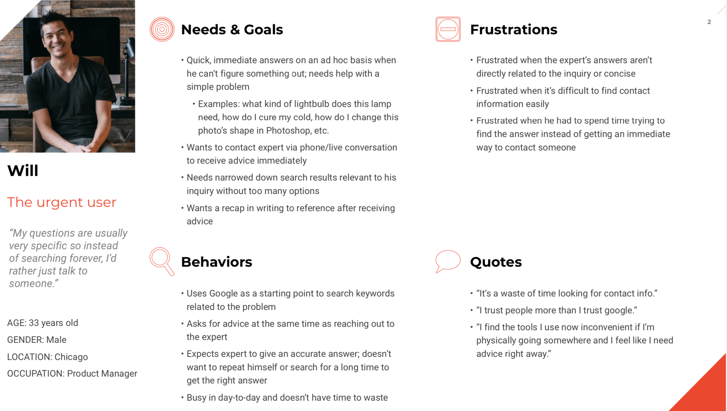
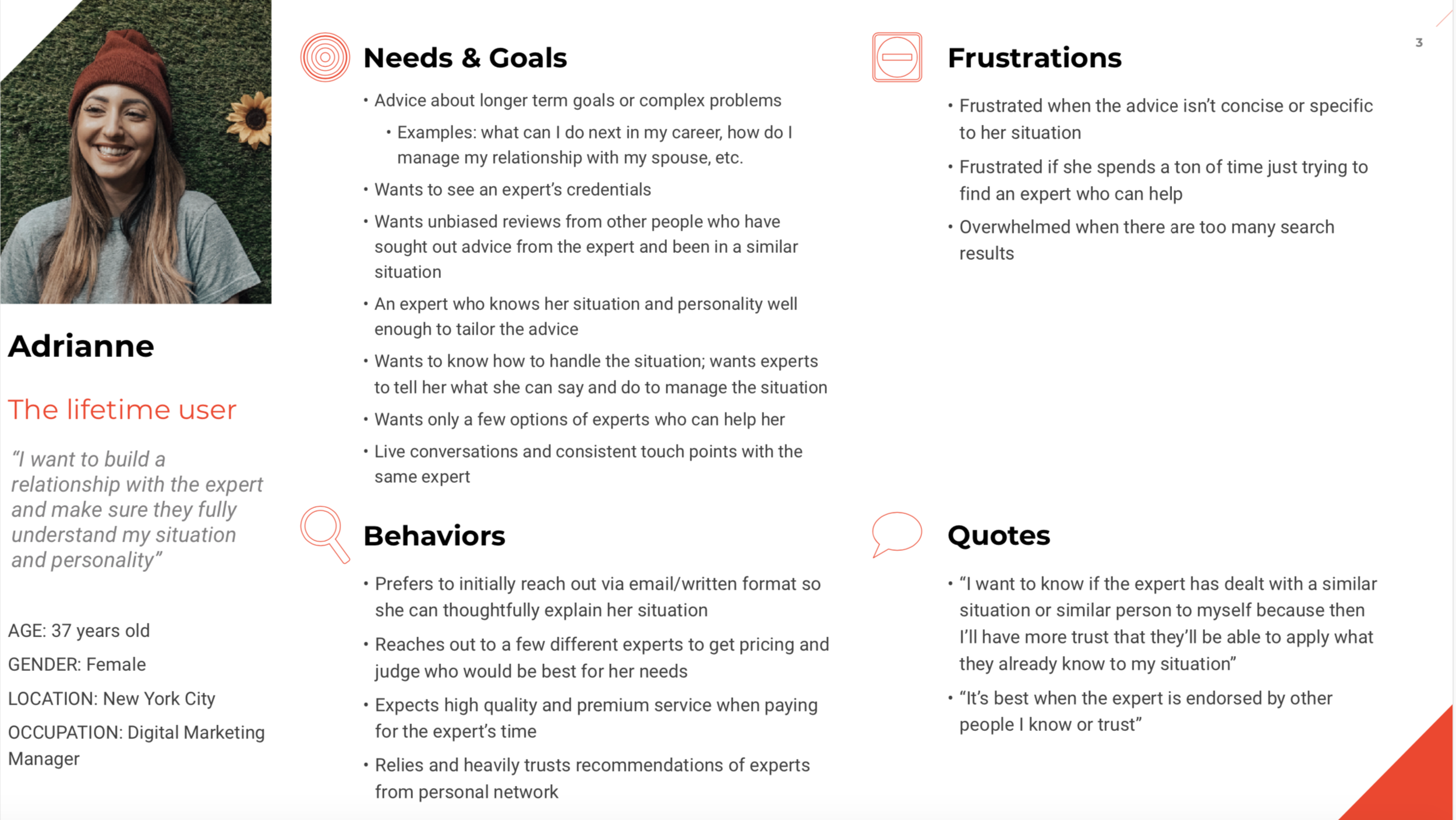
I interviewed five people to understand how they seek answers to their everyday questions. Through an affinity mapping session, I grouped patterns in data and found two distinct personas:

will-image-round.png

Will, the urgent user

He needs help with an ad hoc question that’s specific and simple. He wants to talk to any expert online who can answer his question immediately and accurately.

 
Adrienne-image-round.png

Adrianne, the lifetime user

She has a complex problem where she needs advice, like making a career change. She wants to research different experts and find someone she can build a relationship with over time.


Design

User stories and user flows

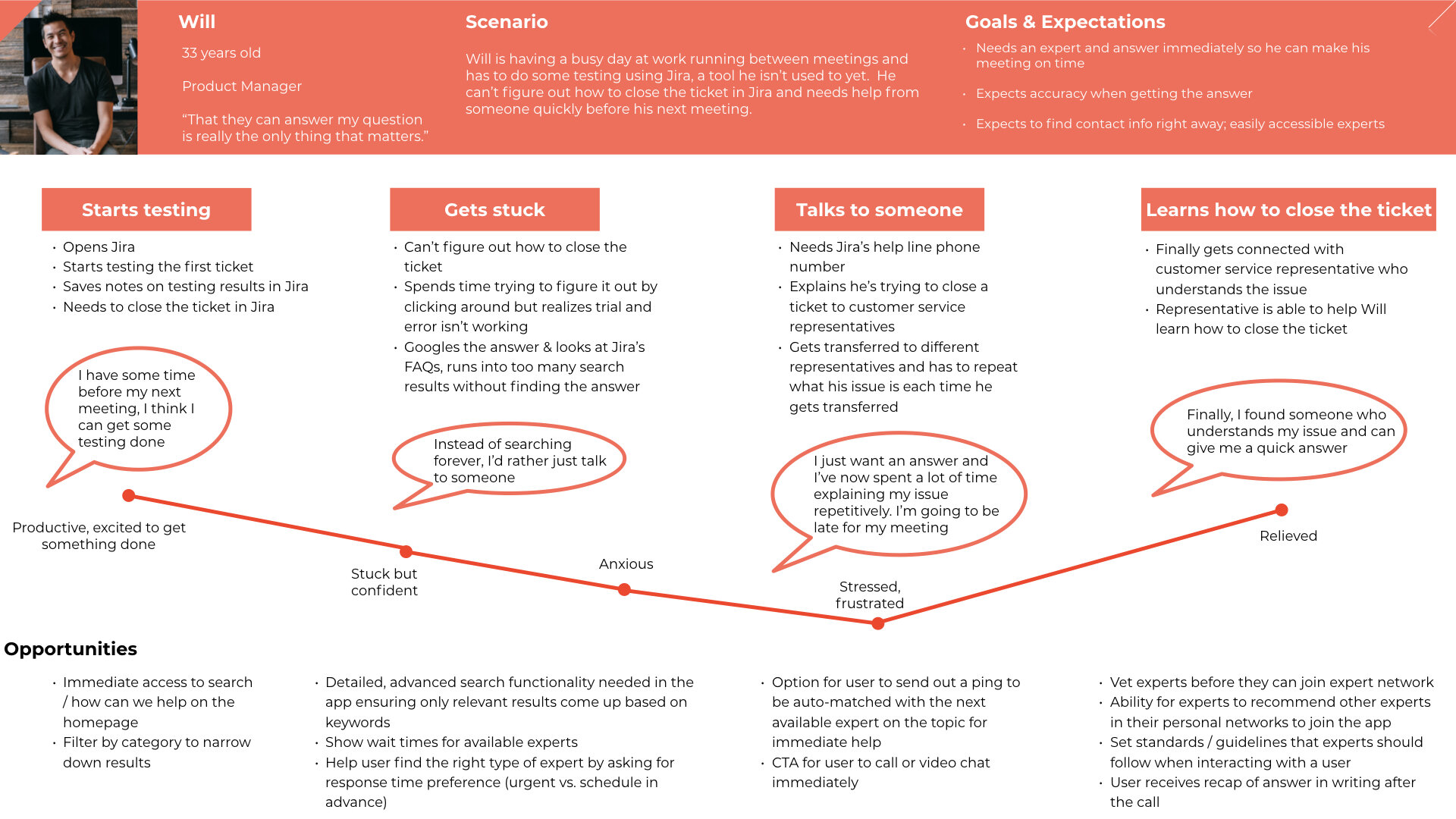
I mapped users’ current experience based on data from my user interviews. By mapping current experience, I could identify opportunities to improve the experience, leading to three core features for which I designed user flows.

core features

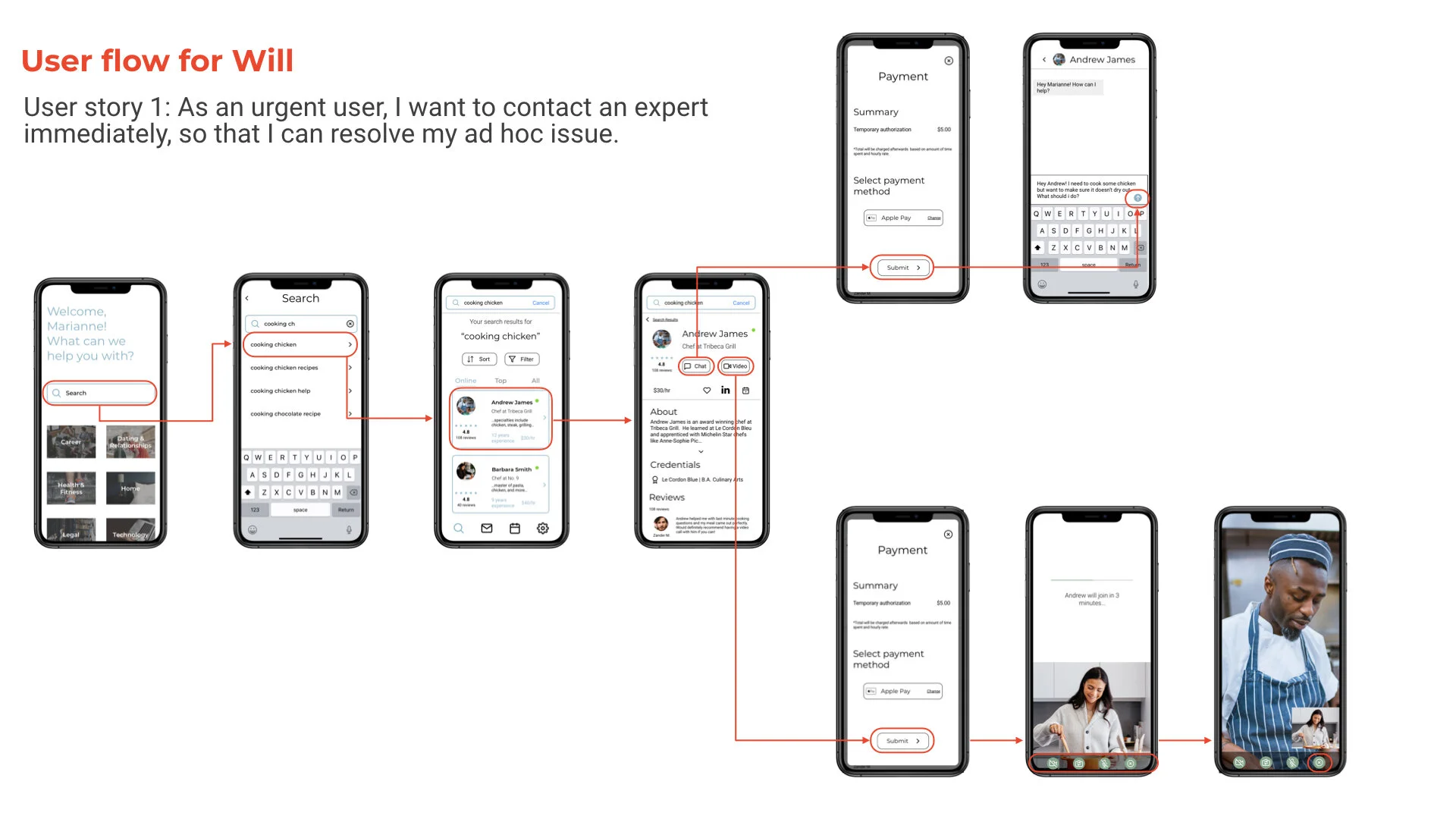
  1. As an urgent user, I want to contact an expert immediately, so that I can resolve my ad hoc issue

    • Meets Will’s need for instant help with his simple questions

  2. As a lifetime user, I want to message an expert, so that I can feel confident they’ll help me with my specific situation before committing to working with them

    • Meets Adrianne’s need for learning more about an expert’s background beyond his/her profile to see if the expert can help her with her situation

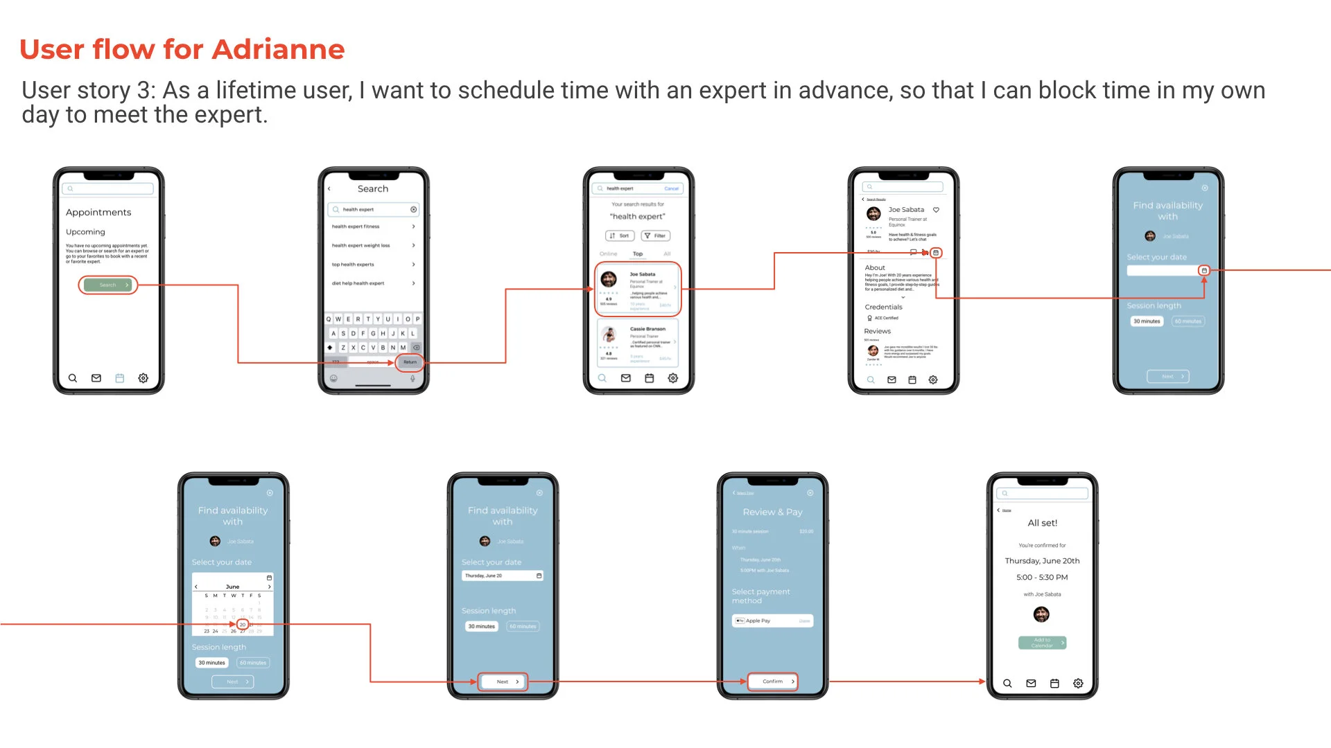
  3. As a lifetime user, I want to schedule time with an expert in advance, so that I can block time in my own day to meet the expert.

    • Meets Adrianne’s need for sticking with the same expert who can get to know her situation at a deeper level, and provide advice to her complex question

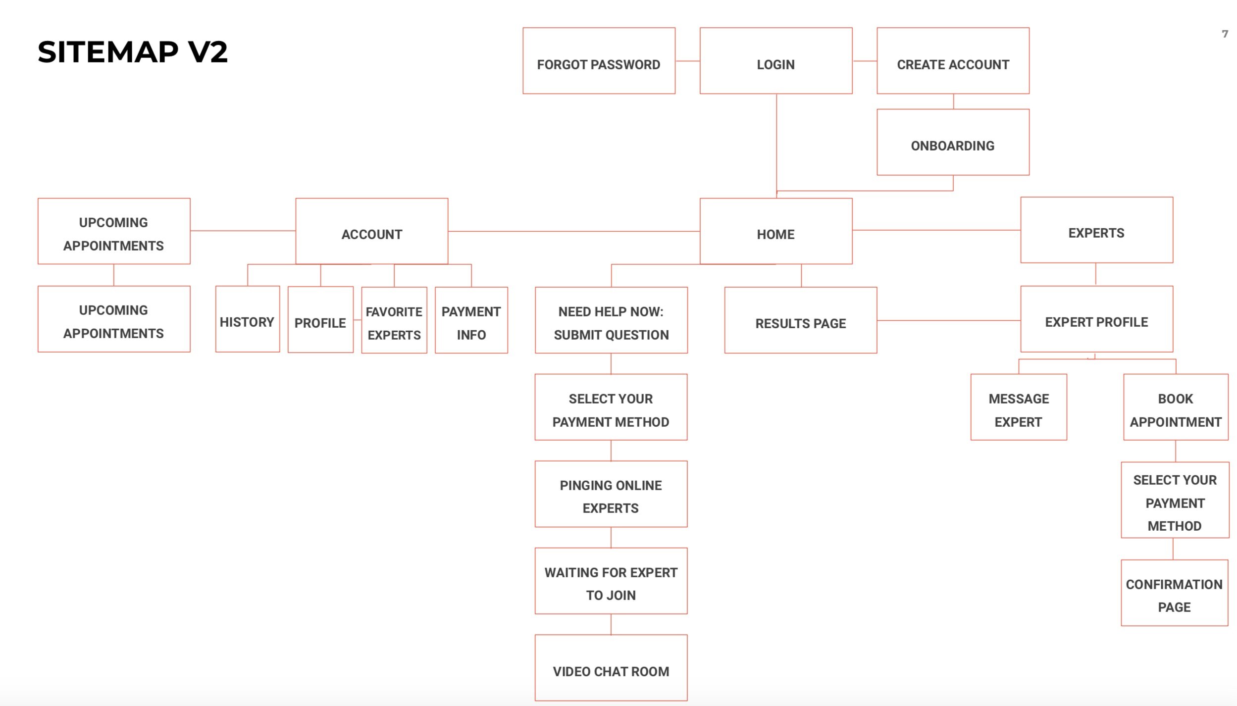
Iterating on the sitemap

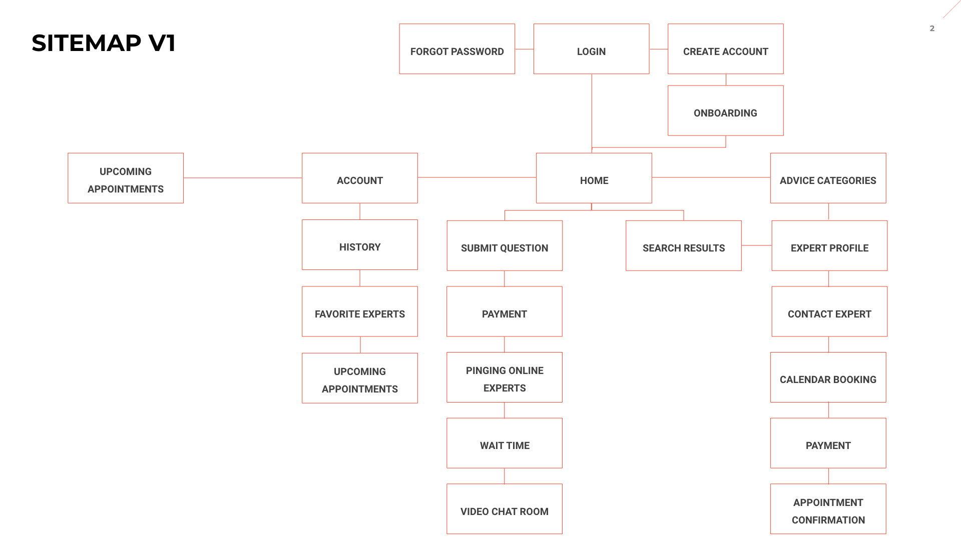
I did a card sorting exercise and used the results to change the app’s navigation.

changes made and why

  1. Moved advice categories from the main navigation to a section within the home page because a majority of users categorized browsing experts by category/find an expert under home

  2. Add a call to action for booking an appointment on the home page instead of solely within the expert’s profile because a majority of users categorized the CTA under the home page which could indicate it needs to be more significant

  3. Put the following elements within the home page to follow the way users categorized them in card sorting

    • Need help now

    • How can we help

    • Advice categories

    • Book an appointment


Original wireframe for homepage and navigation based on sitemap.

Sketching wireframes and building an initial prototype

I went from low to mid to high-fidelity wireframes and created an initial prototype in InVision.

Changes made while sketching

  1. Removed the experts tab from the navigation

    • While sketching, I realized the experts tab would be redundant with a user’s search results, as well as the list of experts a user would see after clicking on a category from the homepage, so I decided to remove it.

  2. Book an appointment CTA removed from the home page

    • While sketching, I realized that since I had upcoming appointments as an action at the top of the screen, I could change that to appointments and get rid of the CTA within the home page in an effort to simplify.

  3. Changed need help now CTA to video chat now

    • Based on feedback from my tutor, the CTA video chat now seemed like it would be a better way to set user’s expectations that they would be entering video chat instead of need help now which was too vague.


Test

The user flow for contacting an expert immediately completely failed, while messaging an expert and scheduling time had success

Results

Contacting an expert immediately: fail

Messaging an expert: success

Scheduling time with an expert: partial success


What I measured

Getting instant help from an expert

  • How easily users can find an expert to help them immediately

  • Errors users make while trying to find instant help

Browsing experts and sending him/her a message

  • How easily users can find an expert to message

  • How easily users can message the expert

Scheduling time with an expert

  • How easily users can schedule time with an expert

Ease of navigation

  • Clarity of navigation: do the layout and navigation make sense?

  • Satisfaction of using the app


How I measured

Learnability

  • Measured with the success rate users completed tasks and how easily users could locate items across the app

Errors

  • Measured using the Nielsen severity rating scale

Satisfaction

  • Measured with observations of the participants’ reactions during the study (qualitative) and a brief after scenario questionnaire to rate their satisfaction (quantitative)


Iterate

Based on the usability test results, I made changes to the user flows and screens for core features 1 and 3, and updated the prototype.

Changes to contacting an expert immediately

Changes made

  • Moved search to the body of the home page and beginning of the user flow to put the user in more control of who they chat with and how (video or instant messaging)

  • Shifted the video chat option to later in the user flow

  • Added an instant messaging option into the user flow

  • Gave the user an opportunity to choose who they want to talk to in the search results

Why it failed

  • All users instinctively went to search immediately in order to find someone to talk to

  • All users expressed confusion reading the video chat now CTA

  • Pinging online experts left too much room for error. A user could be waiting for a long time for their call to be answered, it was forcing users into video chat instead of giving them an option for live chat support, and the user flow didn’t take into account what happens if an expert isn’t online at the time who can answer the question

Changes to scheduling time with an expert

Changes made

  • Showed expert’s availability and calendar as the first step in the booking process to match users’ assumptions

  • Changed wording on the review screen to “Review & Pay” instead of “Review Booking With…”

  • Changed CTA at the bottom of the “Review & Pay” screen to “Confirm” instead of “Submit”

Why it failed

  • When starting the booking process, users assumed they were already looking at the expert’s availability/calendar instead of entering their preference for date and time

  • Wording on the screen to review final details before confirming was confusing for users and led them to believe it was already confirmed

Polishing the UI

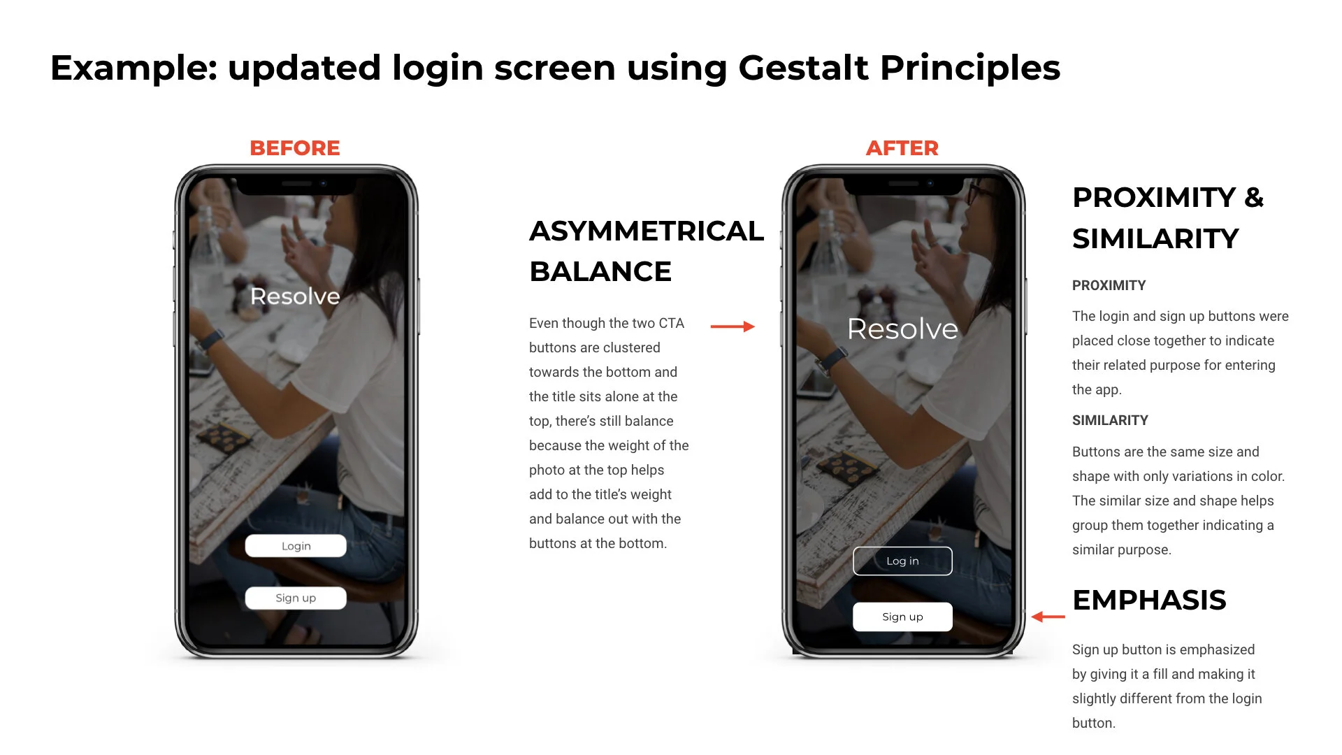
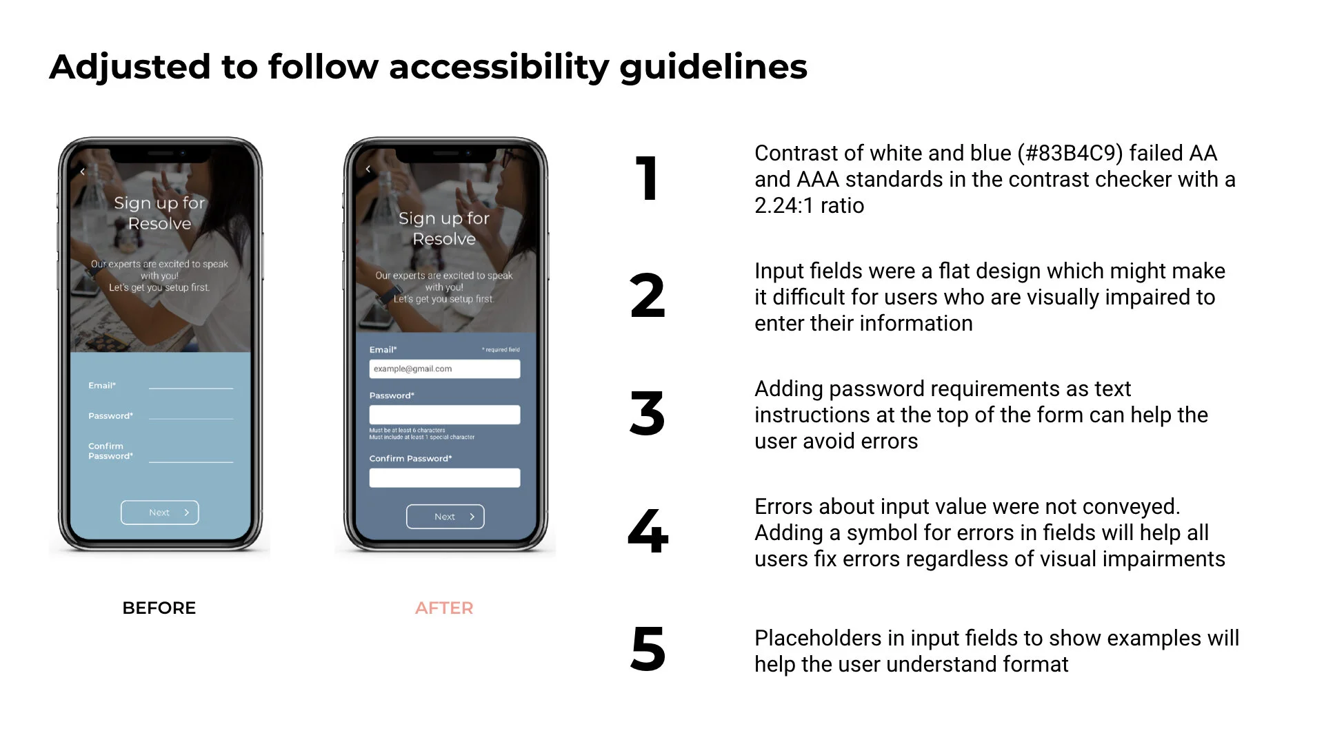
Using peer feedback, Gestalt Principles, iOS Human Interface Guidelines, as well as Web Content Accessibility Guidelines, I cleaned up the interface of the app as well.


Next steps and what I learned

Updated hypothesis

I believe that the changes made to the app’s UI, navigation structure, user flow to get quick help, and user flow to schedule an appointment, have improved the ability for them to complete core tasks. I would know this to be true if performing both tasks passes another round of usability testing.

Next steps

Validate the updated hypothesis

I would do another round of usability testing to uncover any new issues with the changed navigation and user flows.  Since these are core features for MVP, it’s important to make sure they work before moving forward with new functionality.

As I polish the app and the usability for core functionality gets better, I can start adding more features and user flows to test.  Preference testing for UI changes could be used to help the look and feel of the app without a burden on the participant’s time as well.

Specific improvements for the future

  1. Improve the UI

    • Add rewarding interactions for users to make them feel supported and good about seeking advice from an expert

    • Add more color but maintain modern, clean feel of the UI

  2. Build more features and rethink business requirements

    • Add features such as reviewing an expert, integration with social media or user’s network connections to get peer opinions on their experiences with experts, and cancelling appointments

  3. Further define the payment and business model

    • How do you determine how much an expert’s rate can be; how much is someone charged for urgent help vs. scheduled?

  4. Additional improvements

    • How can the app better guide and improve the way a user makes a decision on who they want to talk to? Is there other information about experts that would help sway their choice?

    • What filters in search results would be key? Is there another way to display search results that would be fair to experts but help users make the best decision?

    • Eventually start thinking of the expert’s view and features needed in the app

What I learned and how I’d adjust my process in the future

  1. Test earlier and often

    • Moving forward and if I were to re-do the project, I would test and iterate a few times at the low or mid-fidelity stages of my wireframes until the user flows were validated. This would ultimately save me time and help me move faster instead of investing a lot of time upfront shifting the wireframes to high fidelity before knowing if the user flows actually work.

  2. Continuously revisit the personas and user journey maps throughout the entire process

    • In the future, I would review these deliverables more consistently and often. This would help me keep them top of mind while moving wireframes from low to mid to high fidelity, in creating the design system, polishing the UI, and when iterating.