Olympic Museum
A new destination for fans to dive into Olympic art, culture, and education.
Role
UX Designer
Project
Team
2 UX
2 UI
3 Creative Directors
2 Account Managers
5 Developers
Timeline
10 weeks, May - July 2023
Redesigning the Olympic Museum website was part of a wider digital strategy for the Olympic Foundation of Culture and Heritage (OFCH). With a new website, OFCH aimed to celebrate the emotional and historical moments of the Games, introduce a new brand, and reposition itself as a museum worth exploring, both online and in the real world.
I shaped the UX of the site including core areas like the navigation, Visit, and Explore sections.
View live site
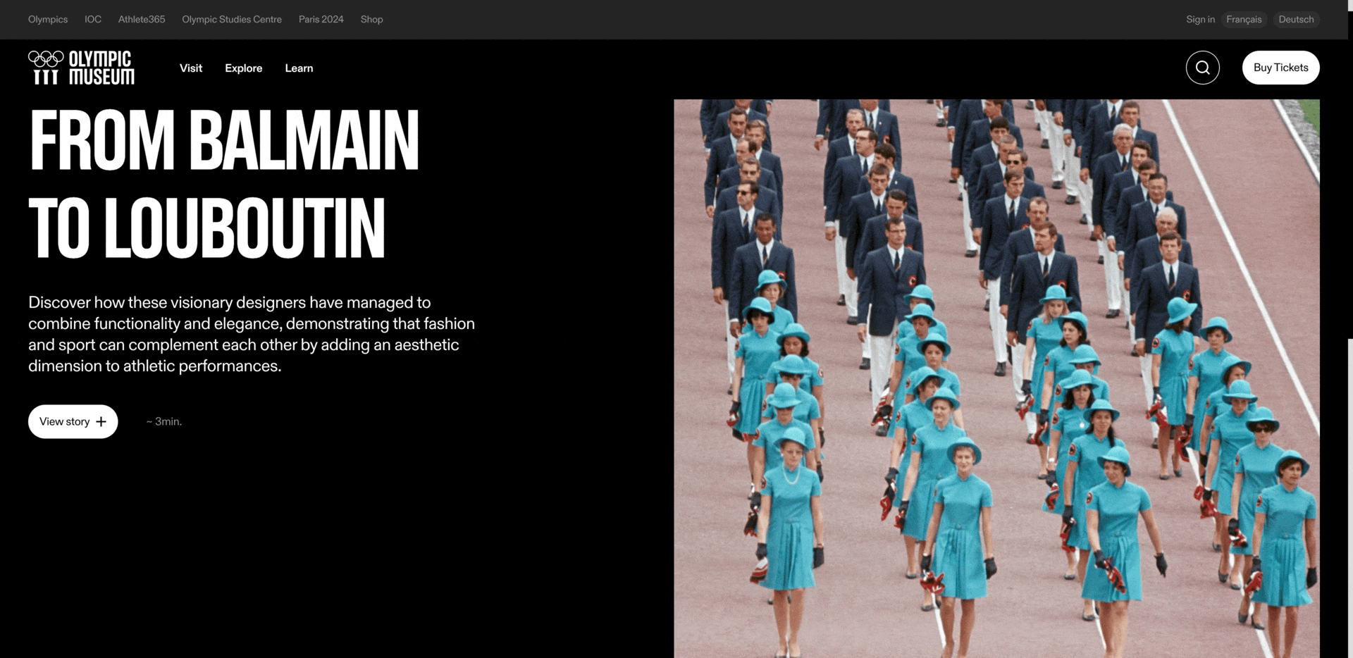
Celebrating the game’s legacy and inviting fans to visit the museum.
Overview
Grow engagement
Business goals
Boost affinity for the brand
Position the museum as the house of Olympism
A fragmented, static, and informational experience.
Key insights
Based on an insights report, UX audit, and competitor analysis I gained an understanding of where users had challenges with the site and opportunities to broaden its audience.
-
Located in Lausanne, Switzerland, the museum receives little foot traffic or tourists. Since most visitors are local, the museum largely depends on return visits and needs ways to attract new visitors.
-
From poor navigation patterns to buried info, extra pages, and poor visual hierarchy, finding key information to plan a visit to the museum is challenging and inefficient.
-
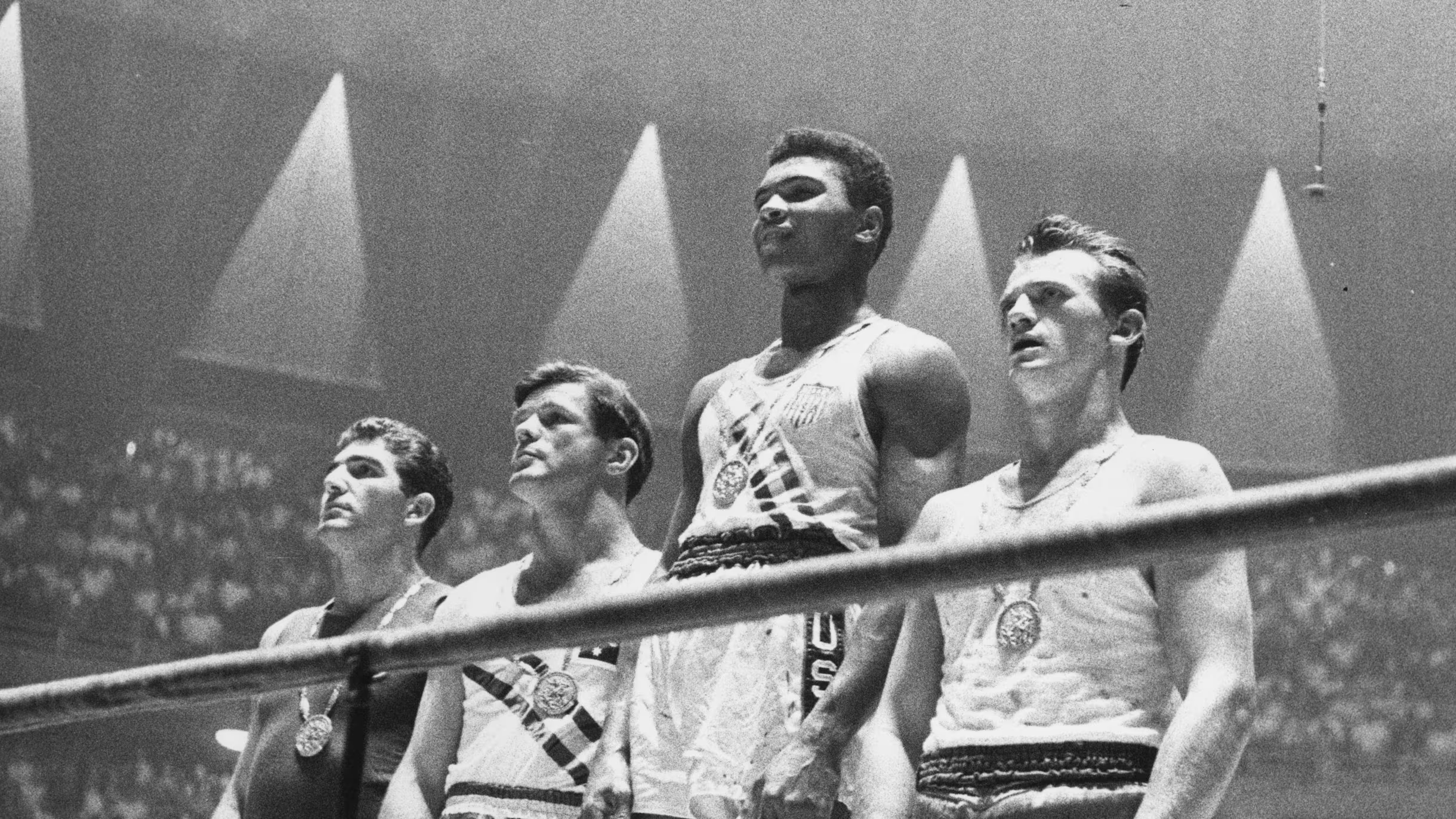
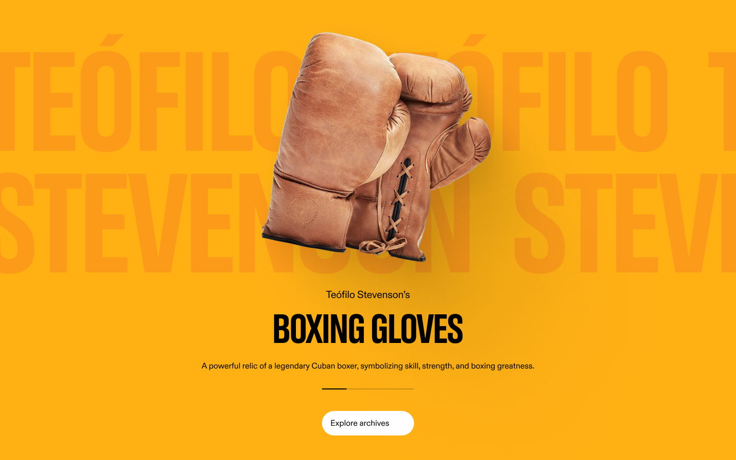
OFCH was working on digitizing artifacts but there was nowhere on the site for users to discover these.

A seamless, immersive, and inspirational experience.
Idea


Design and features
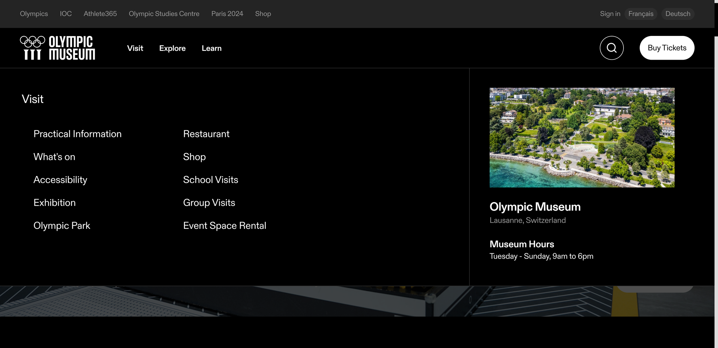
Simplified IA and flyout menu
Reduced the number of items in the main nav so users are not overwhelmed with too much choice
Simplified labels to create clear pathways, making it effortless for users to find what they need
Chose a flyout menu that exposes the second level of the IA to reduce clicks
Digitized artifacts make them accessible to visitors worldwide
To promote active discovery of the collections through engaging storytelling instead of passive browsing, a familiar, swipeable pattern lowers the barrier for exploration and makes the museum’s artifacts accessible to anyone.
Chunk information for a streamlined user flow
The old site dispersed key information across separate pages, creating too much friction to plan a visit.
We grouped information together where it made sense so visitors had an easier time getting key information.
For example, key visitor details like hours, rates, and directions were scattered across multiple pages, forcing users into messy back-and-forth clicking to plan a visit.
Baseline
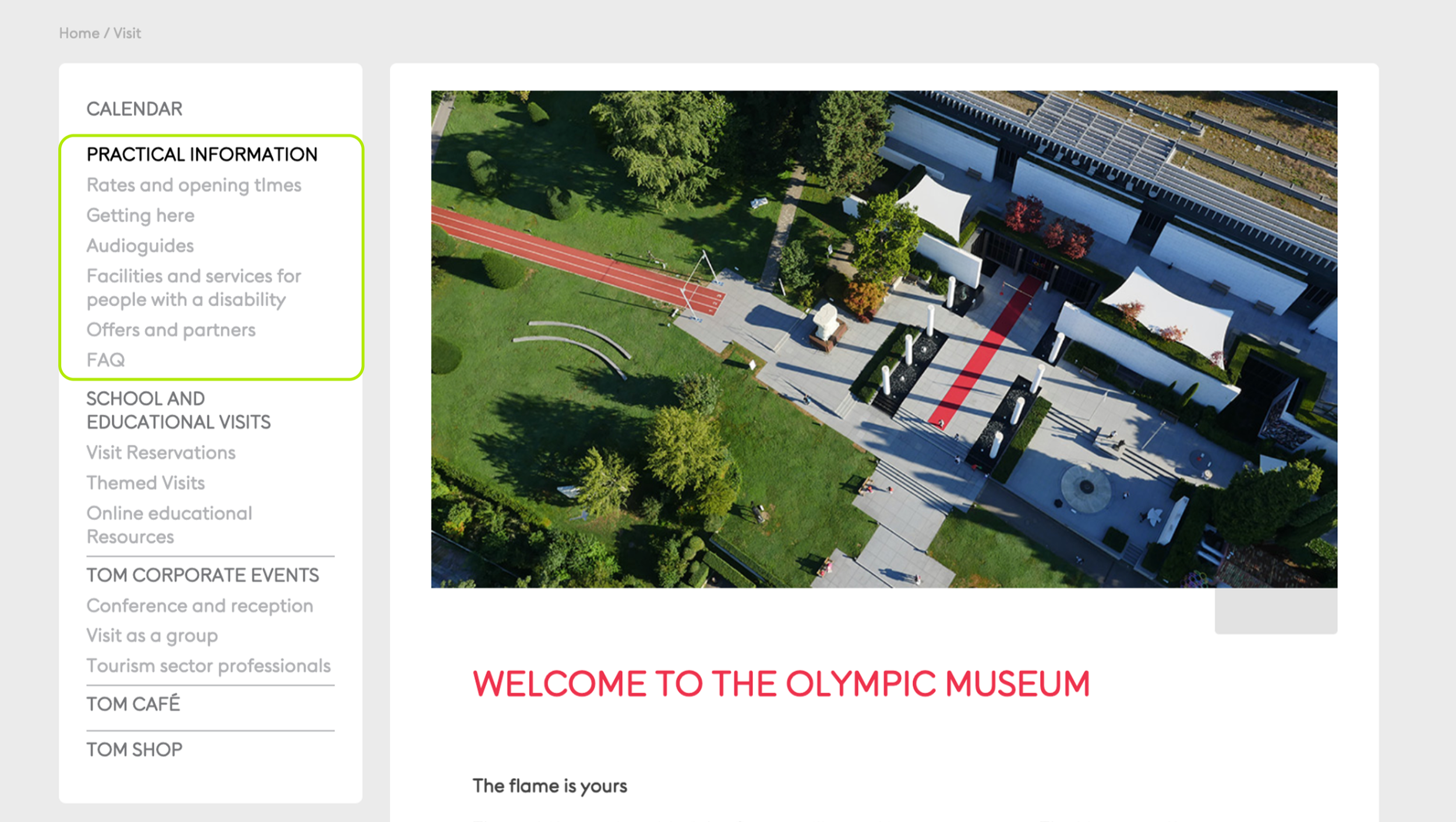
We cut through the clutter by centralizing key information on the Practical Information page, and designed scannable components so visitors got the information at a glance.
Final implementation
Better flows, repositioned brand, and exposure to a global audience.
Impact
OFCH wanted to grow engagement, reposition themselves as the house of Olympism, and grow affinity for the brand.
While post-launch metrics were unavailable, I believe we could measure performance with the following:
Simplified key journeys
Information that once took multiple clicks is now accessible directly from the navigation or core landing pages. This reduced friction made essential content available in as few as one or two clicks.
Positioned for audience growth
We aimed to make content discoverability easier through a clear navigation structure and improved IA. If we saw users reaching target pages in fewer clicks/more efficient paths, and if there were lower dropoff rates, we could assume the navigation and IA were supporting the discovery of new content.
Measuring engagement in the new ‘Explore’ section through increased page views, more unique and returning visitors, deeper scroll depth, and more time on page would indicate audience growth.