Intranet Site
Creating a single source of truth for event resources at BCG.
Timeline
8 months
My role
I was the UX Designer and Project Manager leading end-to-end design, managing the timeline, setting the scope, and collaborating with key team members and stakeholders for input, analysis, and testing.
Goals
Improve the usability of the intranet site for BCG event planners so they can easily find information, templates, and support to plan their meetings and events. Improving the usability of the site was the second piece of the communication strategy.
Success metrics
Increase user engagement
Clearer flow of information from the Meetings & Events team to event planners
Positive feedback from event planners and team members
Design Process
01 User research
User interviews
Persona updates
User journey maps
Usability testing
02 Design
User stories
User flows
Card sorting
Wireframing
03 Evaluate & Iterate
Collect stakeholder feedback
Usability test paper prototype
Iterate wireframes
04 Implement
Finalize content
Implement design using CMS
Creating a single source of truth for event planning.
BCG’s event planners and Meetings & Events team lacked a single source of truth. Information was fragmented, hard to find, and inconsistently updated — making it difficult to plan events or support colleagues efficiently.
Challenge
We believed that by simplifying discovery and navigation, and aligning the site with our communication strategy, we could increase engagement with the Meetings & Events team’s centralized tools and resources.
Hypothesis
“I want tools and resources that standardize the planning process. I’m not sure how to best utilize [the Meetings & Events team] for my event”
User research
User interviews
Since MVP of the site launched in 2018, there were changes to user needs and business models that were no longer captured by the initial personas. Using data I collected from more recent user interviews with event planners, I conducted an affinity mapping session to gain a deeper understanding of BCG’s event planners needs and pain points.
Insights learned from user interviews
Regardless of function, all planners had similar needs, frustrations, and behaviors when starting their planning process: results showed that regardless of department, meeting size, or level of expertise, all planners had similar needs, frustrations, and behaviors, when starting their meeting/event planning and visiting the intranet site
Need a better understanding of how to use the Meetings & Events team: planners expressed a need for clarity on who the Meetings & Events team is and how to use their services
Planners rely on their own network to learn instead of the site or Meetings & Events team: many planners mentioned leveraging their own network to learn best practices and that they only use templates, tools, and resources that they’re used to or that their teammates have passed along
High demand for a detailed checklist: checklists existed in different departments but not everyone had access to them. They were also very specific to the function and potentially missed key considerations for legal and risk. Planners wanted to have a full checklist for both planning and execution that they could tailor to their own event

Additional research via user journey mapping and usability testing on current state prioritized what needed to change
Imperative to focus on
New navigation structure / sitemap
New user flow to find support articles in our knowledge base
Centralize all resources in the knowledge base instead of duplicating links on an intranet site page
Add an about section to explain who the meetings & events team is
High priority
Revise the content and layout of each service page, focusing on setting expectations with event planners on required lead time, criteria to use the service, and cost
Add missing templates and information such as an event planning checklist and information on other initiatives/programs impacting events
Create visual cue to scroll so the user knows to view more content below the fold
Lower priority
Change tone of voice and language to more user centric vocabulary instead of Meeting & Events team’s internal vocabulary. As expressed in user interviews, event planning can be a stressful and time crunched endeavor with a ton of changes to manage along the way. It was important to keep these feelings in mind while determining content on the site and tone of voice

Design
New navigation and sitemap
I used a card sorting exercise to help ground changes to the structure in user data, collected from both Meetings & Events team members and BCG event planners.
Results led to the following changes
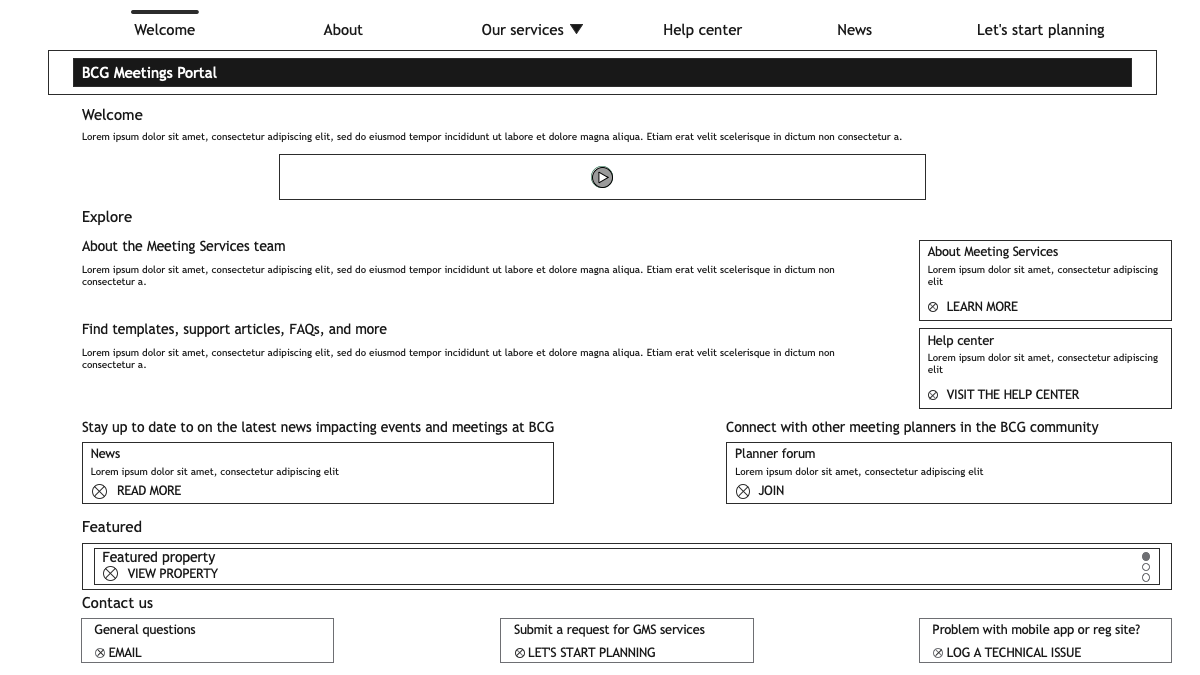
Adding a new, more robust about section as our home page
A more progressive structure into our service pages
Help center page for centralized access to our knowledge base
News tab to host all announcements
New structure of content within our let’s start planning page

User stories and user flows
Using the sitemap as a guide and moving through the list of imperative and high priority fixes, I drafted user stories and flows to cover the most important needs of event planners.
User story 1: as an event planner, I want to learn more about the Meetings & Events team so that I know how they can help me plan a meeting/event.
User story 2: as an event planner, I want to search how to add attendees to my mobile app so that I don’t need to wait for a Meetings & Events team member to come back online.
User story 3: as an event planner, I need to find a checklist detailing all the steps needed to plan a meeting so that I don't miss anything.
User story 4: as an event planner, I need to learn about the latest changes impacting my events so that I can take action immediately.

Wireframing
Using library UI components available in the CMS, I sketched low-fidelity wireframes and collected informal feedback from Meetings & Events teammates. After making changes to low-fidelity wireframes according to team feedback, I translated these to mid-fidelity and collected stakeholder feedback.
Changes made prior to user testing based on stakeholder feedback
Added a home screen: added a welcome tab to the main navigation and created a different home page because it felt like too much information was going in the about page
CTAs changed for more clarity: feedback was that search and read more were confusing
Shifted content in layout: Information showing all of our team members was changed to select team members because it would be hard to keep up to date with ongoing changes. Criteria to use a service was moved further up the service pages to catch users earlier based on feedback that users might get too far down the page only to realize they couldn’t use a particular service

Evaluate & Iterate
Users successfully completed most tasks in user testing, except for finding a support article in the knowledge base
Six participants tested the prototype, performing eight tasks and a satisfaction survey.
Results
7 out of 8 tasks had an average 87% success rate: success rates for finding information about the team, learning about a service offering, requesting help from the team, finding a template, reporting a technical problem, finding an announcement about something impacting events, and finding the checklist were all very high (87% average).
Finding a specific support article (user story 2) failed: success rate for finding a support article related to mobile apps was 50%. Users expressed confusion by the navigation label help center. They resorted to logging a technical issue when they couldn’t find the article and looked under services since there was a service for mobile apps.
Changes made based on user testing
Help center in the navigation was changed to Tools & Resources
CTAs on the home screen were shifted into the body of the page instead of in the right rail
A link to Tools & Resources was added to each service page to catch users who might go to the service pages to find a related template or support article as seen in the testing session
Search CTA was given more real estate across the body of the Tools and Resources page for clearer guidance to our knowledge base with support articles
Tone of voice adjusted to focus on the user and final design was implemented
Referring back to how users felt in their experience on the previous version of the site, I worked with stakeholders to change the content’s tone to focus on the user. Making the tone supportive of planners’ efforts and conveying the Meetings & Events team’s services as optional instead of required, helped the site feel more user centric, friendlier, and lighter.
I used the component library in the CMS to create new pages and execute on the final design.
Results and what I learned
Higher user engagement and clearer communication with planners
2x amount of time spent on the site: amount of time spent on the site and average pages per session per user doubled when redesign launched
25% increase in number of new users: occurred in the month the site launched compared to the month prior, and held steady months after launch
Streamlined communications and information flow: adding a news section centralized all announcements and hosted articles linked in the team’s newsletter. We also launched a planner forum Slack channel to connect event planners cross-functionally so they can share knowledge across the community
What I learned
How to balance stakeholder feedback with user needs and business requirements
Pulling in stakeholders early and often helped me take in their feedback throughout the design process, including it in my iterations along the way
With user data to back up reasons why certain feedback was not implemented, I reconciled what worked and what didn’t
Internal roles, responsibilities, and operating models, heavily influence user experience
Identifying where duplicate efforts were happening internally, aligning team members, and clarifying our content strategy for both the site and communications, ultimately improved the user experience and efficiency in which our team operates